Homepages
that sell:
Extract 1 - Extract
2 - Extract 3 - Extract
4 - Extract 5
Presentation of the study - Contents
of the study
Homepages that sell - 100
pages PDF format - Download
Report (from DigiBuy)
(Extract from "Top menus bars: basic guidelines" - Top menu bars: a few examples)
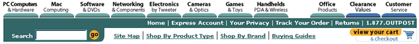
This top menu bar is interesting for several reasons.
First of all, the idea of using half-tabs for the main menu names and putting the categories outside the tabs is quite clever. Had they been placed inside the tabs they would have been squeezed up and difficult to read. Whereas here, they are very clearly displayed, and are "underlined" by the tabs, which are used as upward pointing arrows:
![]()
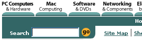
Because there are so many categories, the site has grouped some of them together, e.g. "Software & DVDs", "Games & Toys".
Obviously, with so much information to fit in, it is quite difficult to make the menu easy to read.
Outpost.com solves the problem by putting the most important words in bold, so that users focus on the top line:
PC Computers - Mac - Software - Networking
![]()
They will only read the line underneath if they are interested in that particular category: Cameras & Optics - Games & Toys
![]()
The middle line, which corresponds to a specific group of sales-related categories, is clear and easy-to-read too (good-sized letters, lots of contrast, well-separated categories, etc.):
![]()
Like direct.mwave.com, outpost.com displays its phone number on the top menu bar, which gives the user access to all the links and information they need for purchasing goods and tracking orders.
Finally, the illustrations below show the very neat way that the search engine and shopping cart have been incorporated into the menu:
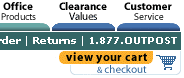
This saves a considerable amount of space for the rest of the homepage.